Origin OS wins hearts in the UK with simple UI

British users celebrate vivo’s cleaner, calmer interface direction
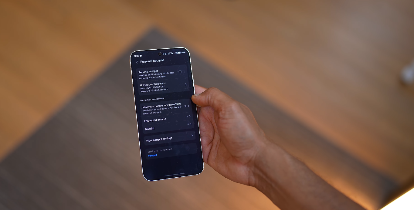
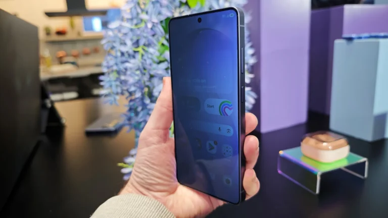
UK users who have tested recent OriginOS builds say the new simple UI direction is one of the main reasons vivo’s software is earning more attention in Western markets. They explain that older vivo skins sometimes looked visually dense, but the latest OriginOS makes the screen feel calmer and easier to read at a glance. British smartphone fans say simplicity is the real premium feature now, because people in the UK check their phones during tiny moments — between tasks, on trains, in shops, or while walking. If the system looks cleaner, every one of those micro-moments feels easier to manage.
British reviewers also say the new layout structure in OriginOS stays more consistent across screens. Earlier Android builds sometimes changed button placement depending on menus, themes, or sub-layers. UK tech voices say this inconsistency forced users to think too much before tapping. With the new OriginOS, they say controls sit where you expect them to sit, and that predictability lowers mental workload. British users appreciate this because most people multitask rapidly between apps, and they want an interface that behaves like a steady assistant — not a puzzle that needs solving again and again.
Another reason this simple UI is praised in the UK is gesture behaviour. British reviewers say gestures now feel easier to trigger because lateral and vertical swipe zones are more forgiving. That matters in real British usage because a large percentage of interactions happen one-handed. A lot of UK smartphone activity takes place while moving — in crowded pavements, public transport, or queue lines. They say when gestures respond predictably, users stop thinking about the interface and focus more on the content that actually matters in the moment.

British users also highlight that the toned-down colour palette in OriginOS supports this simplicity in a more subtle way. Instead of loud highlight blocks and aggressive background elements, the new UI draws less attention to decorative styling. UK reviewers say this makes the OS feel more “Western standard,” because clarity and restraint are usually valued more in British UX culture than flashy design. In simple terms, they say phones look more expensive when the UI is calm — and that simple visual logic helps vivo compete with brands like Samsung and Google in UK retail spaces.
UK commentary also praises simpler notification panels in this new direction. They say alert cards now show more breathing space, so message previews are easier to scan while busy. British users check notifications constantly, but they rarely spend more than one second on each glance. When visual pressure is lower, reading becomes instant. Reviewers say this improvement is not small — it changes the rhythm of daily usage. If a notification block saves a second every time, that second compounds across the day, and the user feels less mentally drained.
British tech writers say quick-settings are also benefiting from the restrained design. They explain that the new OriginOS toggle map behaves more like a “fast utility layer” and less like a dense grid. This helps when users adjust brightness, enable hotspot, or switch network modes on the go. UK users carry strong habits when interacting with this area, and they say the calmer spacing makes actions feel cleaner and faster. Simplicity is not about removing features — it is about making features easier to land with one try.
Reviewers in the UK do add a caution: the simple UI must remain consistent in official UK firmware, not just preview demos. British experts say long-term trust only builds if simplicity survives rollout, carrier validation, UK banking app usage, and daily real-world stress. But the general message from British audiences right now is positive. They say the new OriginOS UI finally behaves like a platform that understands Western comfort standards, instead of trying to impress with decoration. In their words, simplicity is not a downgrade — it is a sign of maturity.
Also Read: Why UK Android fans are switching to Origin OS this year


