Origin OS receives positive response from UK reviewers

British analysts highlight stronger UX discipline in vivo’s software
UK reviewers who study new Android skins say the latest OriginOS release is receiving a noticeably positive response because the system finally looks more calm, more structured, and more in line with Western UX expectations. They say that earlier vivo interfaces often appeared too visually dense, but the latest OriginOS version now shows clearer spacing, calmer surfaces, and tighter alignment rules across menus. British analysts say this makes the UI feel more premium right away, because UK users judge comfort during the first few seconds of interaction. They say initial feel matters more than marketing claims in UK store environments.
British tech writers also say that the new animation consistency is one of the clearest upgrades. They describe the motion pacing as smoother, less jittery, and more controlled between transitions. When UK reviewers compare these animations to Samsung’s One UI and Google Pixel UI, they now say the difference no longer feels one-sided. They describe OriginOS as entering the same category of visual maturity, not just a budget alternative. For UK buyers who scroll between devices in retail shops, this matters because smooth motion is interpreted as higher engineering quality even before deep testing.
UK reviewers also highlight that the revised gesture model gives the software better flow. They say navigation actions are easier to understand because motion logic is more predictable across different screens. One major advantage noted in British commentary is that the new interaction model does not require constant re-orientation. Users do not need to pause and think about where the controls are. For UK smartphone fans, this reduces cognitive load and supports fast switching between social apps, messaging tasks, and content browsing during daily transit.

British analysts say the updated design direction also strengthens confidence in privacy behavior. They mention that permission prompts now feel clearer and better labelled, which helps regular users understand what is happening without deep technical context. UK consumers place strong value on transparency, especially when granting access to sensitive actions like microphone and camera usage. British reviewers say simpler privacy surface structure means fewer accidental approvals and faster detection of out-of-place requests. For the UK market, this kind of clarity is a major plus.
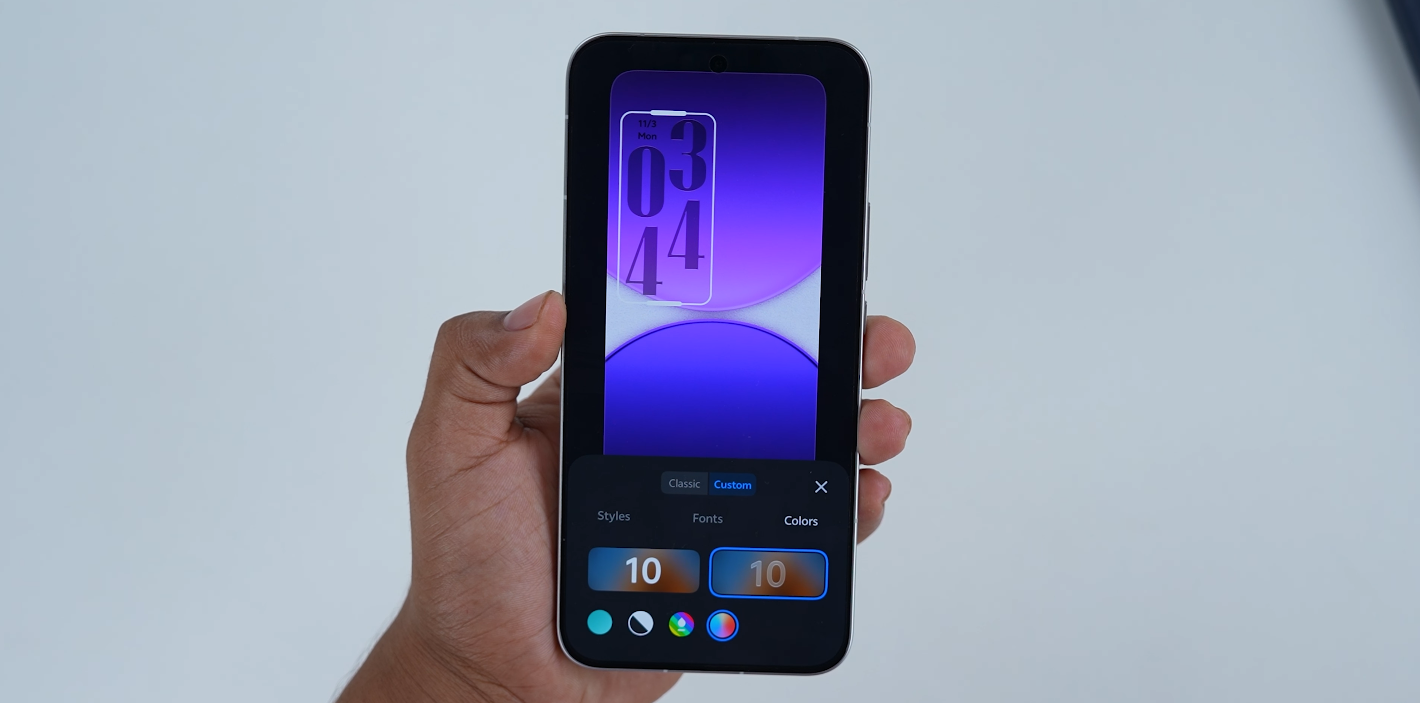
UK commentary also praises the cleaner typography structure. They say the new text hierarchy avoids heavy fonts in areas where the UI does not need attention-grabbing weight. This helps reading comfort, especially when users check system menus repeatedly. They say the simpler type treatment reduces visual stress, and that makes the OS feel easier to live with for long periods. British reviewers often mention this because readability has become one of the most important user comfort metrics in Western UX evaluation.
British tech observers say the refined design also improves first-impression confidence. During in-store testing, buyers usually test scrolling speed, home-screen stability, gesture tolerance, and quick settings responsiveness within seconds. If the OS looks well-balanced at that exact moment, the impression becomes positive quickly. UK analysts say the newest OriginOS version now delivers that type of effect. They say this is one of the main reasons the software is getting better reception among Western reviewers compared to earlier vivo releases.
However, British reviewers still say the final evaluation will depend on how stable these improvements remain in live UK firmware. They say full public judgment requires proper carrier certification, smooth NFC payments, stable banking application usage, and reliable Play integrity behavior. UK experts say that if the current software direction is carried into real British rollout units, then OriginOS could become a serious UI competitor rather than a niche import-focused system. They say that Western acceptance is now realistic, not speculative.
Overall, the positive UK reaction shows that vivo’s new OriginOS identity is being treated as a meaningful UX evolution rather than a surface-level refresh. British analysis says the calmer visuals, more controlled gestures, and clearer privacy labeling are strong signs of international maturity. If regional stability is confirmed once rollout completes, UK reviewers say this update may shift the perception of vivo from experimental design into polished design — something that can stand confidently next to OxygenOS and One UI inside the competitive UK market.


