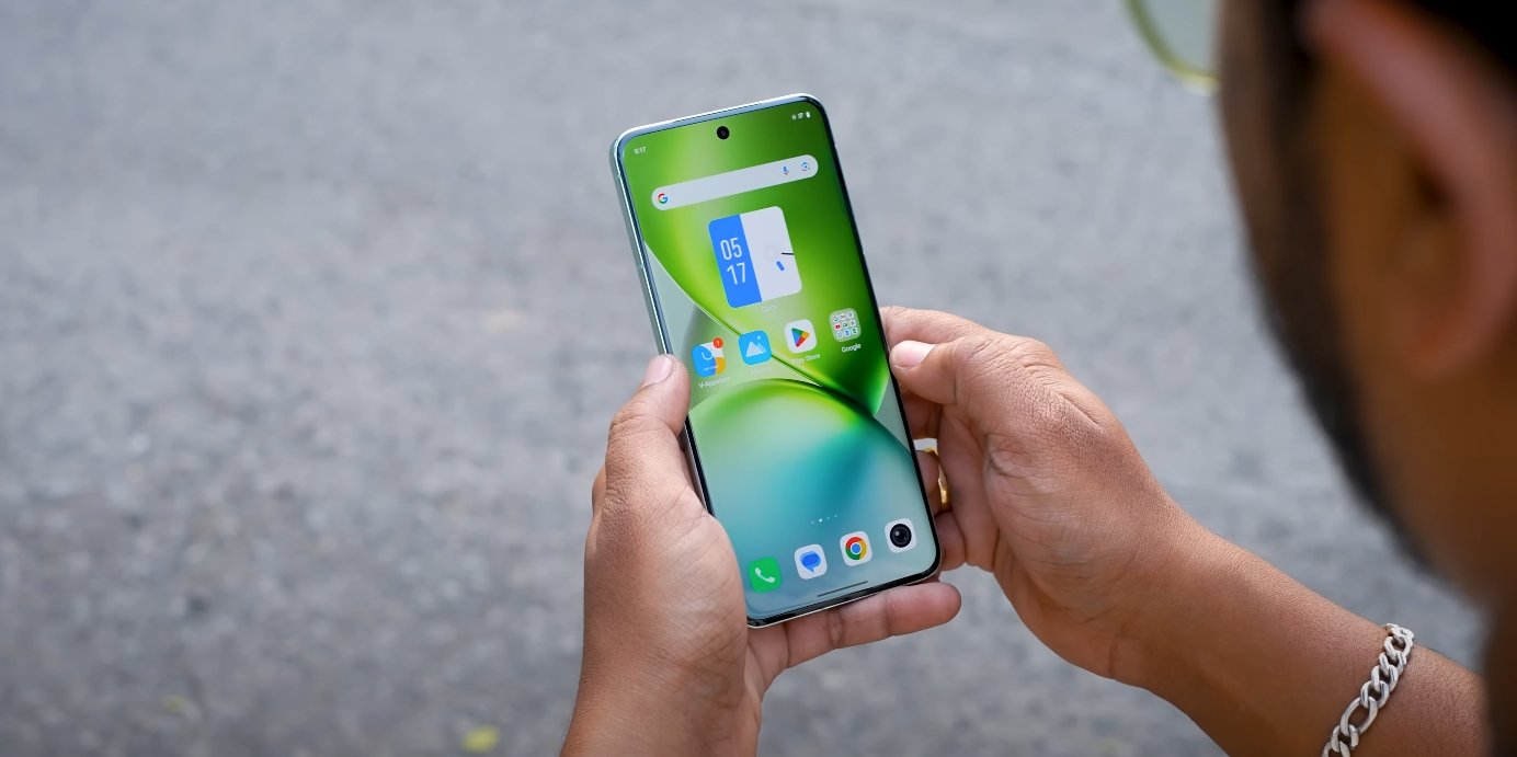
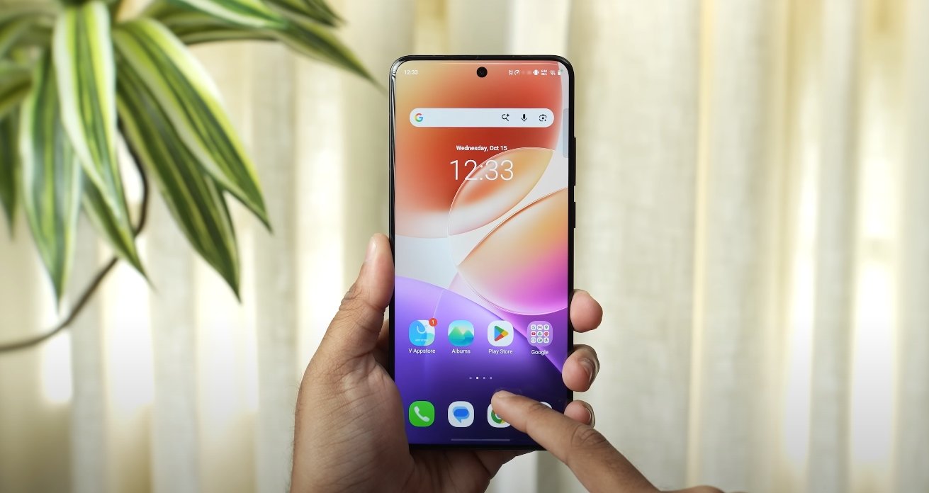
Oppo K15 Turbo Pro spotted in certifications hinting at an upcoming UK release

Oppo K15 Turbo Pro spotted in certifications hinting at an upcoming UK release

New certification filings signal UK entry for Oppo’s next mid-range device

There are early signs that Oppo K15 Turbo Pro may be on track for a UK launch, following reports that the device has passed several certification stages in its home market. The certification activity, noticed by multiple outlets, indicates Oppo is moving ahead with formal approvals that often precede international launches.

According to a recent leak, the K15 Turbo Pro is rumoured to sport a 6.78-inch LTPS display with 1.5K resolution, along with the top-tier Snapdragon 8 Gen 5 processor. The same leak suggested a strong focus on performance, hinting at an 8,000 mAh battery and features aimed at gaming-friendly use.

For UK buyers, the key question will be whether the device includes support for local 5G/4G bands and comes with full UK warranty and service support. Certification in one region is a good sign — it means the brand is preparing the regulatory groundwork. If Oppo includes UK bands in the announced model, that would significantly boost appeal.

Oppo K15 Turbo Pro spotted in certifications hinting at an upcoming UK release

Another detail in the certification chatter relates to the timing. Sources say the certification process aligns with a launch window of early Q2, which matches earlier speculation that the K15-series would appear in spring. A UK arrival in that timeframe would be timely, coinciding with the typical upgrade cycle for many buyers.

From a value perspective, the K15 Turbo Pro appears poised to compete strongly in the mid-range segment. If the flagship-level chip, large battery and high-quality display materialise in a UK-ready offering, Oppo could carve out a compelling option for cost-conscious users wanting high performance without spending flagship money.

Of course, until Oppo issues an official UK launch statement, full details remain speculative. Potential buyers should keep an eye on Oppo’s official UK channels and the UK certification registers, to confirm model numbers, availability and pricing.

In short, the certification signals are encouraging: the K15 Turbo Pro is showing up in the right places ahead of a possible UK launch. For UK-based buyers who have been waiting for a strong mid-range handset with near-flagship specs, this could turn out to be one to watch.

Origin OS boosts productivity for remote UK workers

A Smoother Workflow for Britain’s Growing Remote Workforce

Remote work has become a standard part of daily life in the UK, and the tools professionals rely on now play a bigger role than ever in shaping efficiency, communication, and focus. With increasing numbers of employees working from home, shared spaces, co-working hubs, and while travelling, smartphone software has become a key part of the workday. Origin OS, the latest interface used on Vivo and iQOO devices, has gained positive attention among remote UK workers for offering smooth multitasking, improved workflow organization, and dependable performance throughout the day. The software aims to support productivity not just through speed, but by making everyday tasks feel more natural and streamlined.

One of the main advantages remote workers in the UK have highlighted is how easily Origin OS manages app switching during busy periods. Many professionals use several apps continuously through the day, including email, messaging, note-taking, and video conferencing platforms. Origin OS handles these transitions with reduced lag and fewer reloads, preserving context as users switch between tasks. This helps remote workers maintain mental flow during complex work sessions. Whether joining video calls, reviewing documents, or coordinating with colleagues, the interface remains steady, helping users avoid the frustration of interruptions.

Another helpful feature is the ability to multitask using floating windows and split-screen modes. Remote workers often need to reference information from one app while writing or responding in another. Origin OS allows windows to be resized and moved freely, making it easier to arrange apps in a way that suits the task. For example, a user may keep a chat window open alongside a document editor, or watch a presentation while taking meeting notes. This flexibility reduces the need to repeatedly return to the home screen, saving time and helping users stay focused. The design supports both small adjustments and extended work sessions.

Origin Island, the system’s dynamic status panel, also plays an important role in helping remote workers stay organized. It displays call status, timers, downloads, audio playback, and other ongoing activities in a compact space without interrupting the main task. Remote professionals often handle multiple tools at once, and this feature reduces friction by letting them see essential information at a glance. This helps keep work moving smoothly, especially when balancing communication, scheduling, and content review. Users say this feature makes the phone feel more responsive and aligned with real working habits.

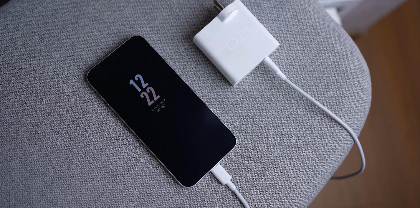
Battery efficiency has become essential for remote workers who spend long hours away from fixed workstations. Origin OS manages background power usage carefully, focusing processing power on active tasks and reducing unnecessary drain when the phone is idle. This helps the device maintain strong performance without requiring frequent charging. For remote workers who attend long meetings, travel frequently, or work outdoors, a battery that supports the day without stress adds real value. The system also includes adaptive charging tools that protect long-term battery health, which supports device reliability over time.

The software’s notification controls have also proven useful for remote professionals who need to remain attentive while avoiding distractions. Origin OS allows users to prioritize key notifications while suppressing alerts that are less important during work hours. This helps maintain concentration and prevents unnecessary interruptions. Workers can choose to allow certain apps to send silent updates or only show alerts at scheduled intervals. These tools support a calm working rhythm and reduce digital noise throughout the day. The design focuses on keeping the phone active when needed and quiet when not.

File handling and cloud service compatibility further support remote workflows. Origin OS provides fast access to recent files and integrates smoothly with commonly used cloud storage platforms. This allows remote workers to retrieve documents, share assets, and collaborate on content directly from their phone. The software also supports efficient drag-and-drop actions between apps, reducing steps when assembling reports, preparing presentations, or managing shared folders. For users who work between laptops, tablets, and smartphones, this consistency helps create a seamless work environment.

Overall, Origin OS has positioned itself as a practical software environment for remote workers in the UK. It supports multitasking, preserves workflow continuity, improves communication efficiency, and provides a stable day-long experience that aligns with modern working patterns. The software emphasizes smooth interactions, energy efficiency, and thoughtful task management rather than overwhelming the user with unnecessary complexity. As remote and hybrid work remain central across the UK, Origin OS offers tools that help professionals stay productive, connected, and organized wherever their workday takes them.

Origin OS offers cleaner notification design for UK phones

Origin OS offers cleaner notification design for UK phones

British reviewers highlight clearer alert readability in vivo’s new UI

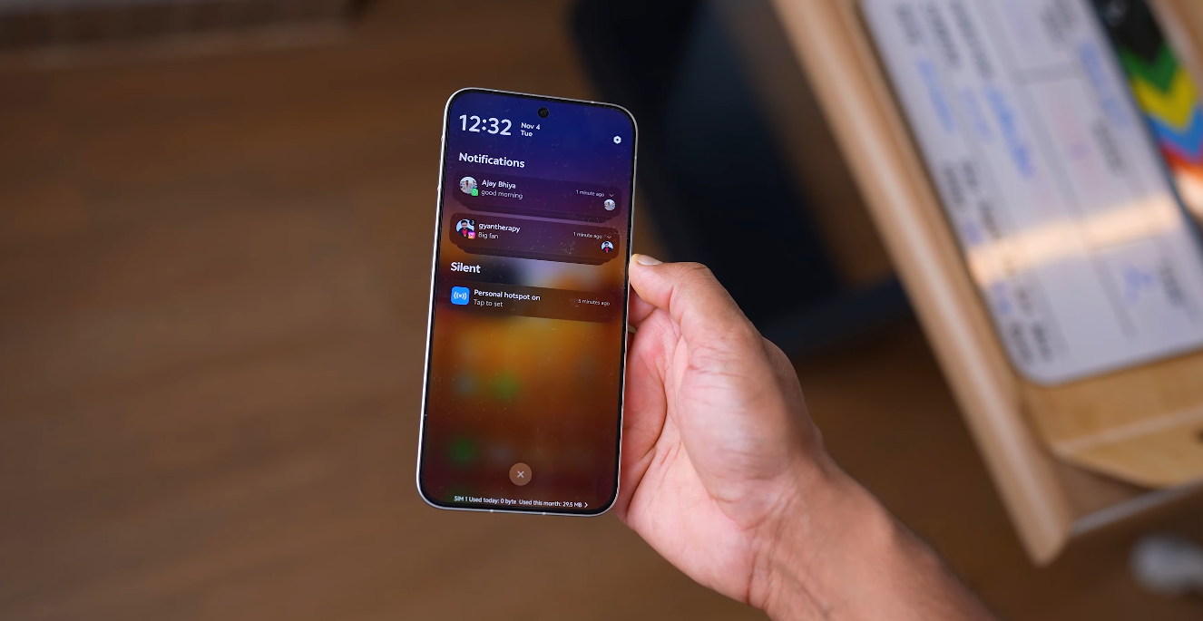
UK reviewers who have tested the latest OriginOS builds say the redesigned notification style feels cleaner, easier to scan, and less visually noisy than older vivo software. They say the panels now show more breathing room around message blocks, which makes alerts more comfortable to read even during fast daily interactions. In shops, bus stops and commuter platforms, British users tend to check alerts quickly without pausing, so a less crowded notification structure supports faster recognition. Observers say this calmer information layout has become one of the most talked-about improvements in the new UI direction because it removes unnecessary distraction from basic alert flow.

British tech analysts also note that the new spacing logic helps notifications carry more “meaning-per-glance.” They say older skins often stacked alert cards so tightly that the eye needed extra time to interpret sender details. In the latest OriginOS, the scene looks more structured: message titles, app names and summary text appear in a cleaner vertical rhythm. UK reviewers say this saves mental effort because users do not need to visually decode multiple design layers. They mention that even small spacing improvements can influence buying impressions in the UK, because first glance readability often determines whether an OS feels premium or not.

UK smartphone testers also highlight animation behaviour during notification pull-down. They describe a smoother and more predictable motion pace that avoids abrupt flicker between partial and full panel states. British users say this matters because a flicker-free notification shade makes the system feel better engineered, especially during one-hand operation while walking or travelling. When the OS does not shake or stutter during pull gestures, users interpret it as evidence of stronger internal tuning. UK analysts therefore say animation discipline is an indirect reason notification clarity feels improved.

Origin OS offers cleaner notification design for UK phones

British users also comment that muted colour accents in the panel help prevent visual overload. They say OriginOS now uses more neutral styling around app markers instead of aggressive highlight blocks. The calmer colour palette makes text more readable and reduces the sensation that alerts are fighting for attention. UK commentary consistently emphasises that Western UX preferences reward subtlety, not visual noise. A clean notification colour strategy therefore becomes more than a design choice — it becomes a usability asset.

Another point UK users mention is that notification grouping looks more logical. Instead of scattering multiple alerts from the same app in disorganised patterns, the newer OriginOS structure collects related messages in more controlled stacks. This makes morning catch-up routines easier because users can scan one group at a time instead of chasing individual fragments. For busy British commuters, this reduction in micro-scrolling improves comfort. Reviewers say this is one area where “calm design equals time saved.”

UK tech blogs also say that the new notification surface pairs well with the refined quick-settings view. When users swipe down, they no longer feel like they must separate two noisy surfaces — the alerts and the toggles now share a single calmer visual logic. This consistency reduces cognitive switching overhead. British analysts say most people do not consciously notice this at first, but the reduced friction becomes obvious over days of real usage. And that is exactly how trust forms: when the system quietly helps instead of demanding attention.

Overall, UK reviewers say the cleaner notification design in the latest OriginOS strengthens the impression that vivo is not just redesigning visuals — it is tightening everyday decision paths for Western usage. British observers say this update will matter in retail environments because a well-structured notification shade is one of the first elements consumers test instinctively. If clarity is delivered instantly, trust rises instantly. And UK commentary says this new OriginOS direction successfully delivers that effect.

Origin OS delivers enhanced customization for UK fans

Origin OS delivers enhanced customization for UK fans

Personalization Features Shape a More Expressive Smartphone Experience

Origin OS is gaining strong attention among UK smartphone users for its enhanced customization features, which offer a level of personal expression that many feel was missing in earlier software versions. The updated interface provides a cleaner aesthetic, more control over visual elements, and new layout flexibility that allows users to shape the look and feel of their device with ease. These improvements have made Origin OS stand out in a market where personalization is becoming an essential part of the smartphone experience.

One of the key enhancements is the redesigned theme system. UK users now have access to a wide range of styles that adjust icons, wallpapers, and typography in a cohesive way. The themes are not only varied in color and mood but also designed to ensure visual consistency across the interface. This means users can personalize the device without losing clarity or readability. The system supports both subtle and bold designs, making it appealing to teenagers, professionals, and casual users alike.

Icon customization has also improved significantly. Origin OS allows users to change icon shapes, sizes, and styles without affecting performance or visual smoothness. This flexibility helps UK users match their smartphone interface to their personal taste, whether they prefer minimal designs or more playful, expressive visuals. The software keeps icon positioning and spacing consistent, so personalization never results in a cluttered appearance. The smooth transitions between icon sets make customization feel seamless and satisfying.

Origin OS delivers enhanced customization for UK fans

Home screen layout options are another highlight for UK fans. Origin OS gives users the ability to adjust grid patterns and widget placements more freely than many other Android skins. The interface supports both symmetrical and expressive layouts, allowing users to arrange apps and information in a way that fits how they use their device. For users who like quick access to messaging, social media, or work-related tools, the layout flexibility makes daily navigation notably more efficient.

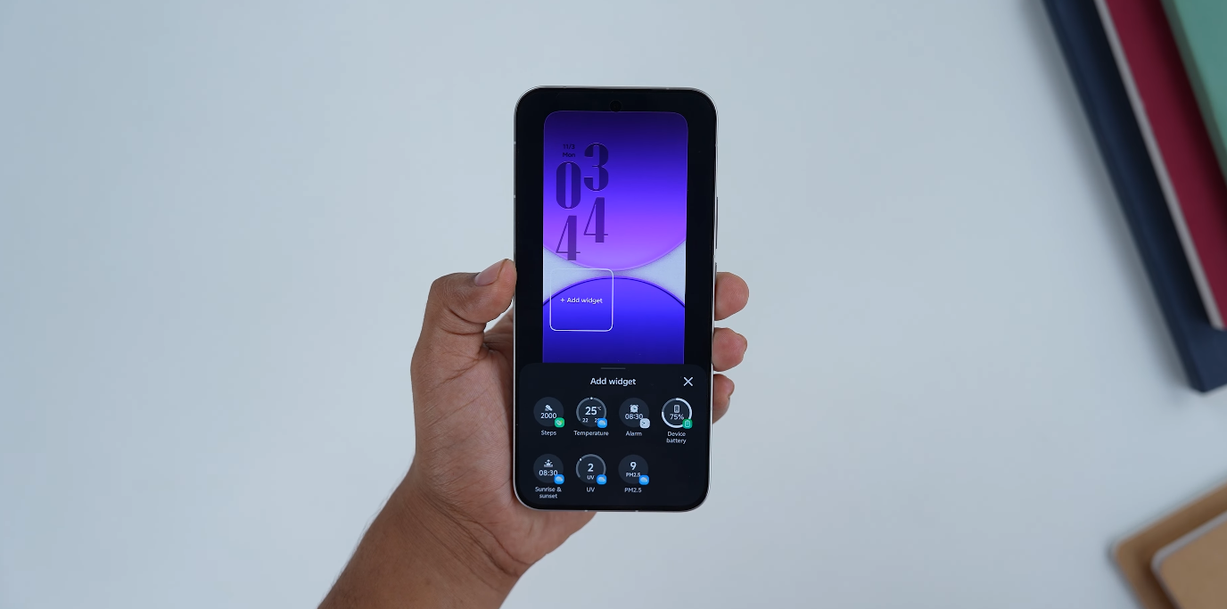
Animated transitions and motion effects contribute to the sense of personalization as well. Origin OS includes smooth animation controls that allow users to choose how actions such as unlocking the device, opening apps, and switching between windows appear visually. These animations are designed to support the experience rather than distract from it. UK users say the motion effects add character to the device and make the phone feel more dynamic without sacrificing battery life or performance stability.

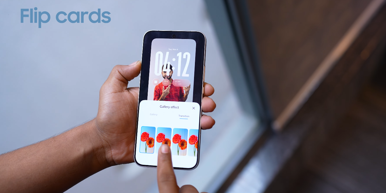
Wallpaper management has also been refined for better personalization. Origin OS offers dynamic wallpapers that shift subtly throughout the day, matching light levels and ambience. UK users who enjoy aesthetic consistency appreciate how these wallpapers change naturally, adding mood without requiring constant adjustments. The system also allows easy import of personal photos and creative backgrounds, ensuring users can highlight moments and styles that matter to them.

Customization under Origin OS is supported by thoughtful system organization and performance optimization. The interface maintains coherence across menus, notification panels, and built-in applications, even when themes are heavily personalized. UK users note that the software feels refined regardless of how much customization is applied. This balance of creativity and consistency makes Origin OS appealing to those who want personalization without losing a sense of polish and everyday usability.

Overall, Origin OS delivers a level of customization that aligns well with the expectations of UK smartphone users who value individuality and visual expression. The software offers a combination of flexible design options, coherent system styling, and fluid interface behavior that allows users to make their devices truly their own. As personalization becomes an increasingly important aspect of mobile technology, the enhanced customization features of Origin OS are playing a central role in strengthening Vivo’s connection with its UK audience.

Origin OS delivers clean aesthetics appreciated in the UK

Origin OS delivers clean aesthetics appreciated in the UK

British Android users praise calmer visual direction from vivo

UK reviewers following vivo software updates say the newest OriginOS version delivers cleaner screen balance and calmer surface behaviour, and this visual tone is being described as a stronger fit for Western expectations. They say that clutter in smartphone interfaces is becoming less acceptable in the UK, because people now use their phones during micro-moments rather than long stationary sessions. A clean OS surface helps speed up those micro-interactions without forcing users to visually decode layout noise. British analysts say this is one of the biggest reasons the new aesthetic is receiving praise.

UK smartphone writers point out that structured spacing is now easier to notice in the latest OriginOS build. They say buttons and text blocks look more separated, making it easier to see where fingers should land. This detail matters because British users often operate phones one-handed during walking, transit, or queue lines. If layout blocks are too dense, accidental taps increase — and UK reviewers say the new stability in spacing lowers those mistakes.

British coverage also says that typography has become a central strength. They note that font weight is calmer, headings are less intense, and descriptive text feels more breathable across menus. When letters are not visually aggressive, the user does not feel rushed by the interface itself. UK buyers say this makes the OS feel more comfortable for repeated menu browsing.

Origin OS delivers clean aesthetics appreciated in the UK

Reviewers in the UK also say the updated animation pacing connects directly to the clean look. They describe motion behaviour that supports the visual calm rather than interrupting it. Smooth transitions help screens blend into each other instead of clashing with abrupt jumps. British writers say this subtle change makes the OS feel premium from the first few swipes.

UK users also connect the cleaner aesthetic to simpler gesture logic. They say that when the interface uses fewer decorative buttons, gestures become easier to understand because nothing visually competes for attention. Cleaner layouts help guide natural swipe direction. British observers say this helps instinct replace memorisation.

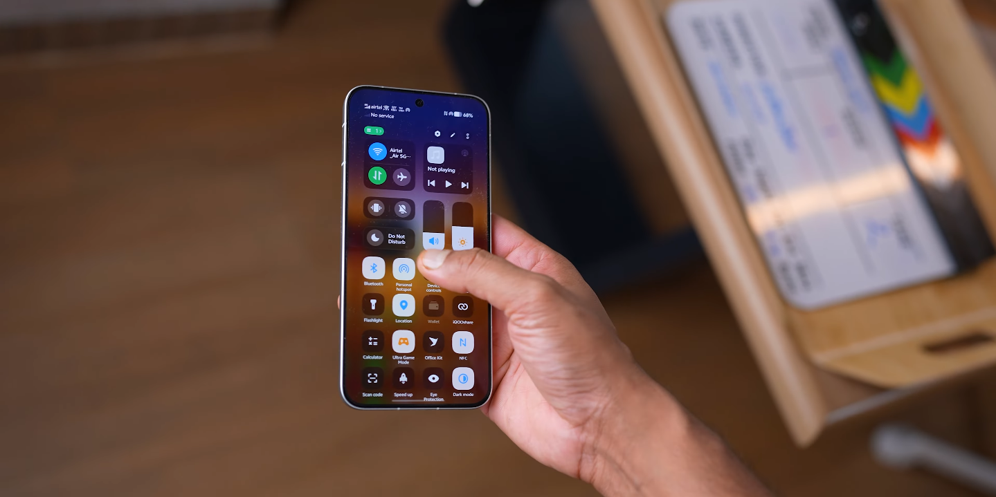
Another positive reaction in the UK centres on the refined quick-settings view. British tech analysts say that the new toggle arrangement looks more focused and less overloaded. When controls appear in structured groups, the user does not have to scan the screen multiple times. This supports faster switching during day-to-day multitasking.

British smartphone testers say that gallery previews feel more coherent as well. They explain that calmer spacing between thumbnails makes it easier to evaluate slight differences between shots. This matters for users who take multiple frames rapidly in locations like riversides, skylines, or crowded high streets. A cleaner gallery layout makes selection easier and faster.

UK media also say that the new aesthetic supports long-term comfort. They say users spend hours per day on screens, and visual fatigue is a genuine UX factor in Western markets. A cleaner interface is not just stylish — it is physically easier on the eye. British reviewers say this will influence how users perceive device quality across weeks and months, not just in first-day impressions.

At the same time, UK analysts say the clean aesthetic must remain stable in British firmware. They say consistency matters more than theme previews. If the OS looks controlled only in marketing demos but not in live retail builds, trust will fade quickly. British reviewers say vivo must prove that visual discipline survives real rollout conditions.

Overall, UK observers say that the new clean aesthetic is more than a design refresh. It is a behavioural shift that makes the OS feel easier to read, easier to trust, and easier to control. British coverage describes the look as calmer, more intentional, and more “Western-friendly” than older builds. They say this direction could help vivo hold stronger place in the UK market if the same visual maturity is backed by stable daily performance.

Origin OS feels more intuitive to UK Android users

Origin OS feels more intuitive to UK Android users

British owners describe vivo’s new software as easier to learn and easier to trust

UK Android users who have tested the latest OriginOS builds say the system now feels more intuitive because layout logic, gesture behaviour, and spacing decisions are easier to understand at first glance. They say older vivo software sometimes required extra learning steps to discover where settings were placed, but the new structure in OriginOS removes much of that friction. British owners say that when the system feels self-explanatory, it lowers the cognitive load of everyday usage. In a country where people constantly switch apps during travel or short breaks, fewer thinking steps make a noticeable difference in comfort.

Reviewers in the UK also say that the OS now behaves more consistently across screens. They describe older versions as having irregular placement patterns where icons and controls occasionally shifted in ways that did not match muscle memory. With the refined version of OriginOS, British users say they do not need to slow down to process what the OS is doing. Gesture zones feel more predictable, motion spacing looks cleaner, and fewer details feel “out of place.” UK users say this consistency makes the system feel trustworthy faster, because predictability is the opposite of software anxiety.

British smartphone testers say OriginOS now lets users navigate faster with fewer visual anchors. They point out that the main controls no longer rely heavily on constant screen icons because gesture triggers are now easier to trigger confidently. When users instinctively know where to swipe, they do not need to pause to look at the bottom navigation bar. UK reviewers say this makes the OS feel lighter and more modern. They connect this to Western UI behaviour, where reduced icon dependency supports cleaner surfaces. The result is that the UI looks simpler, but also behaves smarter.

Origin OS feels more intuitive to UK Android users

Another reason UK users call OriginOS more intuitive is because the system now positions core settings in more logical clusters. British reviewers say older Android builds sometimes buried deeper functions inside multiple layers. But on the newer OriginOS version, brightness controls, network switches, and quick action toggles appear in more direct locations. UK users say this reduces trial-and-error navigation. When basic tasks require fewer taps, the UX feels more responsive without needing faster hardware. British reviewers say this is why the intuition level matters more than raw device horsepower.

British observers also say that typography and spacing contribute to the intuitive effect. Cleaner font weights and clearer label hierarchy make it easier to scan menus quickly. They say that when text does not fight for attention, users can focus on what actually matters. This supports simple mental mapping — the brain remembers where tools “feel like they belong.” UK users say that when this mapping becomes automatic, the OS feels effortless. They say this describes the new OriginOS direction accurately, especially compared to older layouts that appeared visually loud.

British commentary also suggests that improved intuitiveness could influence buyer perception during in-store testing. In the UK, smartphone purchase decisions often happen after very short time windows on retail demo units. If a device can communicate clarity in the first few seconds, it gains an advantage. Reviewers say that OriginOS now feels recognisable enough that UK users do not fear switching from another Android skin. If the system explains itself visually, then the mental barrier to switching brands becomes smaller.

At the same time, UK reviewers say that final judgement will depend on real UK firmware rollouts. Gesture confidence and clear menu structure must remain stable after regional adjustments, especially when Google certification and UK network behaviour are added. British users say intuition is not just a visual feature — it is something that must remain consistent in daily life. However, they also say the current OriginOS direction is promising because the system finally behaves like it understands Western comfort standards. UK observers believe that if updated firmware remains stable, this intuitive behaviour could become a major long-term advantage for vivo in the UK market.

Also Read:  UK fans list Dell 14 Plus 2 in 1 among 2025’s most awaited laptops

Origin OS brings new visual identity for UK smartphone fans

Origin OS brings new visual identity for UK smartphone fans

British users react to vivo’s latest refined UI direction

UK smartphone followers who track vivo updates say the newest OriginOS styling now looks more organised, calmer in tone, and more consistent across interface surfaces — and this change is shaping how British users interpret vivo’s maturity as a brand. They say the new visual identity does not rely on aggressive colour density or overloaded surface graphics. Instead, it focuses on clearer alignment rules, simpler structure and cleaner screen balance. For UK Android observers, this calmer visual baseline makes the OS feel more premium from the first few taps, which matters because British buyers evaluate UI comfort very early during device testing in stores.

British reviewers also say the updated design tone makes the OS easier to live with during daily usage. They point out that reduced visual complexity helps users understand where controls are, without needing to study the interface repeatedly. They say that this reduction in visual pressure is important because UK consumers often multitask in fast switching scenarios such as travel, transit, or work-break browsing. If the screen looks calmer, the mind interprets controls faster. UK analysts say that this is one of the key reasons the new visual identity feels like an upgrade rather than a skin refresh.

Another recurring point in UK feedback is the emphasis on more predictable motion consistency. British reviewers have been paying attention to animation pacing because transitions often influence perceived software stability more than benchmark charts. They now describe the new animation behaviour in OriginOS as more balanced, with fewer abrupt shifts and less motion conflict between UI cards. This matters because British users judge “smoothness” as a sign of quality. When motion behaviour feels controlled, they interpret the software as better engineered. UK coverage says this is a major step toward Western-style UX discipline.

Origin OS brings new visual identity for UK smartphone fans

Typography refinement is also being highlighted by UK observers. They say that the new font weight distribution, calmer headings, and more structured spacing between sections make the interface easier to scan. British tech writers often say that UI clarity is measured by how quickly text blocks can be absorbed at a glance. With the updated visual identity, they describe menu labels as easier to parse, which improves comfort during everyday usage tasks like checking notifications, reading quick settings descriptions, and browsing inside core system screens. They say this clarity helps build trust because it lowers reading friction.

UK experts also say that the calmer visual identity supports better user confidence during permission handling. Privacy dashboards and sensitive controls are easier to interpret when the interface does not overload the user with visual noise. British users care about this because privacy signals in the UK are considered serious behavioural anchors rather than design details. When UI clarity rises, the user experience around permission logic becomes easier to trust. They say this new visual identity therefore reinforces privacy usability indirectly, even before any deeper features are evaluated.

British commentary continues to mention that the benefits of refined design must show consistency inside real UK firmware builds. They say the new visual identity looks promising in demonstrations, but final judgment still depends on UK rollout behaviour. British network validation, UK banking app stability, NFC payment behaviour, and Play integrity compliance are the final checkpoints that decide adoption confidence. They say that visual maturity is a positive signal — but users in Britain still want confirmation that stable performance follows the same refined philosophy.

Even with this cautious view, UK tech communities say the shift in OriginOS visual identity already changes how vivo is perceived in Western discussion. They say OriginOS now looks like something designed to stand alongside established Western UI philosophies — not a regional skin built only for one country. For UK smartphone fans, this matters because it positions vivo as a brand that understands international comfort standards, and not only domestic visual preferences. They say this new identity gives vivo a stronger chance to compete for attention in UK stores, especially when buyers judge phones quickly based on feel rather than raw specification tables.

Overall, British feedback frames the new OriginOS visual identity as calmer, clearer, more structured, and more aligned with Western UX expectations. UK observers say the software now feels more intentional — and this alone increases perception of brand maturity. They describe the update as a meaningful shift that could support stronger British reception if the UK firmware rollout maintains stability across sensitive real-world usage.

Also Read:  iQOO 15 may arrive in the UK sooner than expected

Origin OS wins positive buzz across UK social media

Origin OS wins positive buzz across UK social media

Vivo’s Software Update Gains Momentum Among Online Communities

Origin OS has been receiving strong positive buzz across UK social media platforms, where users are sharing their experiences with the software’s refined performance, smoother interface, and expanded customization features. The reaction marks a shift in how Vivo’s smartphones are being perceived in the British market, as the company continues to refine its software identity for global users. The supportive discussions appearing on platforms like TikTok, Instagram, and community forums show that the system is resonating particularly well with younger audiences who value both design and daily usability.

One of the main reasons for the rising buzz is the smoother user interface introduced in the latest Origin OS updates. UK users who upgraded from earlier versions of Vivo’s software describe the experience as more refined, especially when scrolling, opening apps, or switching between tasks. The animation engine has been carefully tuned to make actions feel more fluid and predictable. This change has become a frequent talking point in short-form social posts, where users showcase how quickly the system responds to gestures and commands. The result is a perception of increased premium quality, even on mid-range devices.

Customization has also become a major factor in the popularity of Origin OS within UK social media spaces. Teenagers and young adults are sharing screenshots and screen recordings of themed home screens, icon packs, widget setups, and wallpaper combinations. The ability to shape the phone’s design without losing visual consistency makes the experience appealing to people who enjoy personal expression. Influencers and content creators have joined the conversation by reviewing theme packs and promoting unique layout ideas, helping the trend spread further. This has given Origin OS a cultural presence beyond simply being a system update.

Origin OS wins positive buzz across UK social media

Another reason users are recommending Origin OS is the improved multitasking performance. British users who frequently switch between messaging apps, video calls, editing tools, and social media platforms say the software remains smooth and responsive throughout. Features like floating windows and split-screen modes are being highlighted for their practicality in everyday life. Social media posts often show how easy it is to reply to messages or manage work tasks while still watching videos or browsing content. This has made the software especially appealing to students, remote workers, and creators who rely on their phones for productivity.

Battery efficiency improvements are also contributing to the positive reception. Many UK users share posts demonstrating longer battery life after updating to Origin OS, especially during travel, workdays, and commutes. The software’s adaptive management system prioritizes active apps while conserving power in background processes. This means the phone runs cooler and lasts longer without requiring manual adjustments. Discussions online reflect relief among users who had concerns about heavy usage draining their battery too quickly. The improved efficiency aligns well with UK lifestyles that often involve long hours away from charging points.

Security and privacy controls have received attention too. UK social media users appreciate being able to manage app permissions more clearly and track how apps access data. The transparency tools help build a sense of trust in the system, especially for users who rely heavily on online banking, work communication, and personal organization apps. Posts discussing these features often highlight the benefit of a system that protects user data without overcomplicating daily interactions. This has helped strengthen the reputation of Origin OS as both secure and user-friendly.

Overall, the positive buzz surrounding Origin OS across UK social media indicates that users view it as a meaningful improvement rather than just a visual update. The combination of smooth performance, customization freedom, reliable multitasking, and thoughtful battery and privacy features has made the system feel well-balanced for modern phone use. The strong engagement online suggests that Origin OS is helping Vivo build a more confident and recognizable identity within the UK market. For many users, the software has become more than an upgrade — it has become a reason to consider Vivo devices as competitive choices in a crowded smartphone landscape.

Also Read:  Origin OS earns strong user satisfaction in the UK market

Origin OS wins hearts in the UK with simple UI

Origin OS wins hearts in the UK with simple UI

British users celebrate vivo’s cleaner, calmer interface direction

UK users who have tested recent OriginOS builds say the new simple UI direction is one of the main reasons vivo’s software is earning more attention in Western markets. They explain that older vivo skins sometimes looked visually dense, but the latest OriginOS makes the screen feel calmer and easier to read at a glance. British smartphone fans say simplicity is the real premium feature now, because people in the UK check their phones during tiny moments — between tasks, on trains, in shops, or while walking. If the system looks cleaner, every one of those micro-moments feels easier to manage.

British reviewers also say the new layout structure in OriginOS stays more consistent across screens. Earlier Android builds sometimes changed button placement depending on menus, themes, or sub-layers. UK tech voices say this inconsistency forced users to think too much before tapping. With the new OriginOS, they say controls sit where you expect them to sit, and that predictability lowers mental workload. British users appreciate this because most people multitask rapidly between apps, and they want an interface that behaves like a steady assistant — not a puzzle that needs solving again and again.

Another reason this simple UI is praised in the UK is gesture behaviour. British reviewers say gestures now feel easier to trigger because lateral and vertical swipe zones are more forgiving. That matters in real British usage because a large percentage of interactions happen one-handed. A lot of UK smartphone activity takes place while moving — in crowded pavements, public transport, or queue lines. They say when gestures respond predictably, users stop thinking about the interface and focus more on the content that actually matters in the moment.

Origin OS wins hearts in the UK with simple UI

British users also highlight that the toned-down colour palette in OriginOS supports this simplicity in a more subtle way. Instead of loud highlight blocks and aggressive background elements, the new UI draws less attention to decorative styling. UK reviewers say this makes the OS feel more “Western standard,” because clarity and restraint are usually valued more in British UX culture than flashy design. In simple terms, they say phones look more expensive when the UI is calm — and that simple visual logic helps vivo compete with brands like Samsung and Google in UK retail spaces.

UK commentary also praises simpler notification panels in this new direction. They say alert cards now show more breathing space, so message previews are easier to scan while busy. British users check notifications constantly, but they rarely spend more than one second on each glance. When visual pressure is lower, reading becomes instant. Reviewers say this improvement is not small — it changes the rhythm of daily usage. If a notification block saves a second every time, that second compounds across the day, and the user feels less mentally drained.

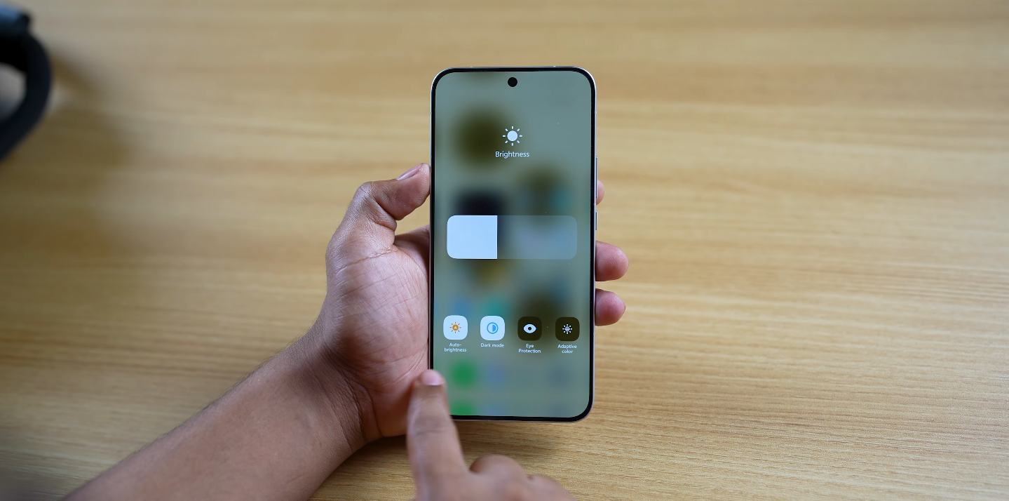
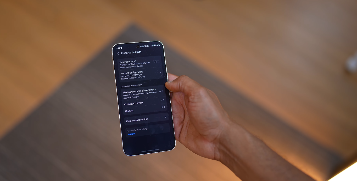
British tech writers say quick-settings are also benefiting from the restrained design. They explain that the new OriginOS toggle map behaves more like a “fast utility layer” and less like a dense grid. This helps when users adjust brightness, enable hotspot, or switch network modes on the go. UK users carry strong habits when interacting with this area, and they say the calmer spacing makes actions feel cleaner and faster. Simplicity is not about removing features — it is about making features easier to land with one try.

Reviewers in the UK do add a caution: the simple UI must remain consistent in official UK firmware, not just preview demos. British experts say long-term trust only builds if simplicity survives rollout, carrier validation, UK banking app usage, and daily real-world stress. But the general message from British audiences right now is positive. They say the new OriginOS UI finally behaves like a platform that understands Western comfort standards, instead of trying to impress with decoration. In their words, simplicity is not a downgrade — it is a sign of maturity.

Also Read:  Why UK Android fans are switching to Origin OS this year

Origin OS themes gain popularity among UK teenagers

Origin OS themes gain popularity among UK teenagers

Young Users Embrace Vivo’s Customization Culture

Origin OS themes are rapidly gaining popularity among teenagers in the UK, who are embracing Vivo’s software for its creative freedom and stylish personalization options. The ability to fully customize icons, wallpapers, fonts, and animations has made Origin OS a trending topic among younger smartphone users. For many teens, their Vivo device has become a canvas to reflect their personality and digital identity.

The rise in popularity began soon after the global rollout of Origin OS 6, which introduced a redesigned Theme Store with more localized and youth-oriented designs. UK users now have access to colorful layouts, animated widgets, and dynamic wallpapers inspired by music, gaming, and pop culture. Teenagers are especially drawn to the smooth transitions and motion effects that make the interface feel fun and interactive.

Social media has played a major role in spreading the trend. UK teens frequently share screenshots and short videos of their customized home screens on platforms like TikTok, Instagram, and Snapchat. Popular hashtags such as #OriginOSThemes and #VivoSetupChallenge have become spaces where users exchange ideas and recommend new themes. The visual creativity and sense of individuality these themes offer have helped Origin OS gain cultural traction among the youth.

Origin OS themes gain popularity among UK teenagers

Another factor driving enthusiasm is accessibility. Origin OS allows effortless theme changes through a simple interface, meaning users don’t need technical skills to personalize their devices. The OS also supports mix-and-match customization — combining icons from one theme with fonts or wallpapers from another. UK teens appreciate how this flexibility lets them change the look of their phone as easily as updating an outfit.

Gaming-inspired and minimalist designs are among the most downloaded themes in the UK. Many teenagers prefer bold, neon visuals that match their gaming setups, while others choose softer color palettes that fit modern lifestyle trends. Origin OS’s ability to adapt to these contrasting aesthetics has made it appealing to a wide range of young users.

The growing collection of third-party content is adding to the excitement. Independent designers are creating themes that reflect British culture, from football-inspired layouts to London cityscapes and indie music motifs. Vivo’s openness to community-driven content allows UK creators to participate directly, turning the Theme Store into a collaborative digital marketplace.

Parents and tech reviewers also note that the trend reflects a broader shift among UK teenagers — from using phones purely as communication tools to viewing them as personal design statements. The smooth performance and artistic detail of Origin OS themes make Vivo’s devices stand out in classrooms and social circles alike.

As 2025 continues, the popularity of Origin OS themes shows no signs of slowing down. With each update adding new animations, seasonal designs, and interactive effects, UK teenagers are finding more ways to personalize their phones and express themselves digitally. For many, Origin OS has transformed from just another Android interface into a creative lifestyle choice — one that celebrates individuality, color, and self-expression.

Also Read:  UK analysts discuss the impact of Origin OS on Vivo sales

OriginOS 6 vs Pixel UI stability comparison

OriginOS 6 vs Pixel UI stability comparison

Comparing Stability and Reliability Between OriginOS 6 and Google’s Pixel UI

Vivo’s OriginOS 6 and Google’s Pixel UI both aim to deliver refined, efficient, and visually cohesive Android experiences, but they do so through distinct philosophies. While Google’s Pixel UI focuses on simplicity and reliability, OriginOS 6 emphasizes animation smoothness, adaptive design, and deep system customization. Stability, however, is the foundation of both. Examining how these two perform in real-world conditions reveals their strengths and trade-offs when it comes to system reliability, app consistency, and long-term performance.

Pixel UI, designed directly by Google, is often regarded as the benchmark for Android stability. Built on clean code with minimal visual effects, it maintains high consistency across updates and devices. The lightweight design helps ensure fewer crashes, faster patching, and smoother long-term performance. Pixel UI is tightly integrated with Google’s system architecture and security framework, which minimizes conflicts between system services and third-party applications. Apps load predictably, system animations are steady, and the software rarely stutters—even after months of usage. The key advantage lies in Google’s direct control over both hardware and software, creating an optimized ecosystem that delivers consistent results.

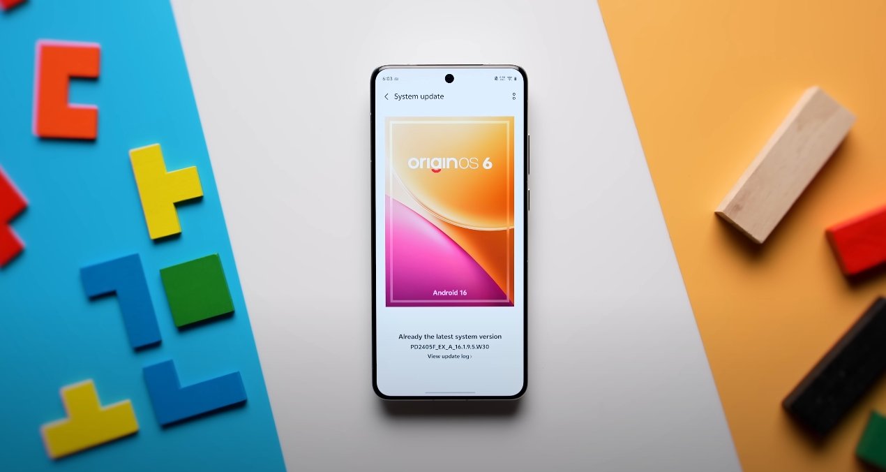
OriginOS 6, by contrast, takes a more ambitious approach. Vivo has focused on design fluidity and animation-rich interaction while working to maintain core system stability. The update introduces the Origin Smooth Engine, an optimization framework that enhances responsiveness and reduces frame drops. This engine dynamically adjusts CPU and GPU workloads depending on user activity, helping maintain performance while minimizing overheating or excessive battery drain. As a result, OriginOS 6 feels fluid and visually engaging without compromising stability in most conditions. However, the system’s complexity—especially with its advanced visual layers and dynamic effects—means it demands slightly more resources than Pixel UI.
OriginOS 6 vs Pixel UI stability comparison

In daily use, Pixel UI tends to remain steady even under heavy multitasking. Google’s optimization ensures that background apps, notifications, and gestures maintain consistency. Crashes are rare, and app compatibility is generally flawless since developers often test their apps on Pixel devices first. Software updates also arrive faster and more reliably, keeping stability intact over the device’s lifespan. This reliability makes Pixel UI a preferred choice for users who value smoothness through simplicity rather than through heavy visual design.

OriginOS 6 delivers a different type of stability—one that focuses on sustained fluidity rather than minimalism. Vivo’s software engineering has matured considerably, reducing bugs that previously affected earlier builds. App switching, split-screen mode, and gesture navigation work consistently without freezing. The system can handle background tasks efficiently, keeping frequently used apps active without forced reloads. That said, occasional hiccups can appear in early software versions or on older hardware, typically during high-load scenarios involving heavy animations or complex widgets. Vivo has been addressing such issues through incremental updates that refine performance and reduce resource overhead.

Another aspect of stability lies in thermal and memory management. Pixel UI’s lightweight structure allows it to maintain stable temperatures and predictable RAM usage, even during gaming or prolonged use. OriginOS 6 balances this through adaptive performance scaling, but because of its visual complexity, it occasionally consumes slightly more memory. Vivo compensates for this with intelligent memory compression and AI-driven resource distribution, which minimizes the impact on smoothness. In practical terms, both systems deliver reliable performance, though Pixel UI feels steadier under extended workloads, while OriginOS 6 feels more dynamic and fluid.

Software update reliability also contributes to long-term stability. Google’s update cycle is punctual and transparent, with monthly security patches and yearly major upgrades. Pixel UI’s consistency in updates ensures that bugs are swiftly addressed. OriginOS 6, while improving, still depends on Vivo’s rollout schedule, which can vary by region and device. Nevertheless, once updates arrive, they generally enhance system balance, battery optimization, and visual performance without disrupting user data or workflow. Vivo has also committed to multi-year software support, aligning closer to industry standards.

In terms of app stability, both systems perform well but differ in scope. Pixel UI’s app management prioritizes efficiency and reliability, keeping background services consistent without aggressive closure. OriginOS 6 uses AI-assisted memory prioritization to achieve a similar result, allowing users to keep more apps open without lag. However, due to its layered design and extra visual effects, the probability of minor animation delays can be slightly higher on lower-end devices.

Ultimately, when comparing stability, Pixel UI maintains an edge in pure reliability and long-term predictability. It’s optimized directly by Google, ensuring clean performance, minimal errors, and flawless app integration. OriginOS 6, on the other hand, brings a refined and fluid experience with greater customization and liveliness while maintaining strong stability levels that have improved substantially over past versions.

In conclusion, Pixel UI delivers the most consistent and steady Android experience, ideal for users who prioritize reliability and straightforward performance. OriginOS 6 offers comparable stability but with a more vibrant, design-forward interface that favors smooth animations and personalization. Both systems perform admirably in daily use, but while Pixel UI represents the peak of functional stability, OriginOS 6 stands out for its balance between performance, aesthetics, and innovation—proving that Vivo’s software now competes confidently with Google’s polished Android experience.

Also Read:  Nothing Phone 3A Lite camera samples reveal true colors

OriginOS 6 vs iOS 18: Multitasking & Gestures Compared

OriginOS 6 vs iOS 18: Multitasking & Gestures Compared

Multitasking and Gesture Navigation: Comparing Vivo’s OriginOS 6 with Apple’s iOS 18

When it comes to multitasking and gesture-based navigation, both OriginOS 6 (from Vivo) and iOS 18 (from Apple) offer significant enhancements that reflect their different priorities. OriginOS 6 emphasizes flexible multitasking, floating windows and customizable gestures, while iOS 18 prioritizes smooth system-wide gesture behavior, cross-device continuity and refined multitasking for large screens. This comparison explores how each handles multitasking tools, gestures and workflow for users in the USA.

OriginOS 6: Multitasking Features
OriginOS 6 introduces a range of multitasking enhancements designed for power users and creative workflows. It supports floating app windows that can overlay other apps, resizable split-screen layouts and multi-window drag-and-drop between applications. The system’s multitasking hub, known as “Origin Island”, acts like a live status bar and quick-action space where users can drag items such as images or links from one app to another seamlessly. These features make it easy for users to run, for example, a video call, document editor and browser side-by-side and move content across them without returning to the home screen.

Gesture support in OriginOS 6 is extensive. The system offers multiple edge-swipe functions for navigation, split-screen activation, and floating-window invocation. Users can assign custom gestures to specific functions—such as a swipe up from a corner to open a floating window, or a two-finger swipe to trigger split-screen. OriginOS 6 documentation mentions support for as many as 26 gesture combinations, which gives users significant control over how they navigate and multitask on their device. The system is designed so that transitions between apps and windows are smooth, helping maintain workflow momentum.

OriginOS 6 vs iOS 18: Multitasking & Gestures Compared

iOS 18: Multitasking Features
iOS 18 continues Apple’s focus on delivering refined multitasking on iPhones and iPads. While multitasking on the iPhone remains more constrained compared to tablets, iOS 18 includes enhancements for split-screen, improved stage management on larger screens and smarter app switching supported by Apple Intelligence. On compatible iPads (via iPadOS 18), users can use Stage Manager to group multiple apps in a windowed layout, switch between stacks and invoke multitasking gestures like pinches or swipes of multiple fingers. The system caters to users who move between iPhone and iPad environments and want continuity across devices.

Gestures in iOS 18 are streamlined and intuitive: for example, swiping up from the bottom returns to the home screen, swiping up and holding brings up the App Switcher, and swiping from the top-right corner opens the Control Center with multiple pages of controls. While not as deeply customizable as some Android skins, these gestures are consistent and integrated into the overall Apple ecosystem, helping users transition smoothly between device types.

Key Differences

  • Flexibility vs Simplicity: OriginOS 6 gives users more control and customization over how multitasking and gestures behave, enabling floating windows, drag-and-drop multitasking and custom gesture assignments. iOS 18 takes a more guided approach, delivering a consistent and polished experience with less customization but tighter integration across devices.

  • Multi-window Support: On OriginOS 6, floating windows and resizable split-screens are part of the experience even on phones, enabling workflows like editing content while watching a video. On iOS 18, full windowed multitasking is stronger on iPads than iPhones; iPhones see improved gestures and smarter app switching but fewer floating windows.

  • Gesture Depth: OriginOS 6 supports a wide variety of gesture combinations (up to 26) and allows user-defined shortcuts, corner swipes and multi-finger gestures for multitasking. iOS 18 uses a more standardized gesture set that works across iPhones and iPads, offering reliability and discoverability rather than breadth of customization.

  • Cross-Device Continuity: iOS 18 benefits from Apple’s ecosystem: gestures and multitasking workflows work consistently across iPhone, iPad and Mac, making tasks like dragging content between devices seamless. OriginOS 6 introduces cross-device features (phone, tablet, PC) but the ecosystem breadth and maturity differ.

  • Learning Curve vs Consistency: Users adopting OriginOS 6 may spend time customizing gestures and workflows to suit their style, which can enhance productivity but requires effort. iOS 18 offers a more plug-and-play experience: gestures and multitasking behavior are consistent and predictable, beneficial for users who prefer simplicity.

Which Experience Fits You?
If you’re someone who uses your phone like a mini workstation—toggling between multiple apps, dragging content between windows, customizing gestures to your workflow—OriginOS 6 provides a rich set of tools for multitasking and navigation customization. It’s especially appealing for users who value control and are comfortable exploring settings and layouts.

If on the other hand, you prioritize smooth, dependable gesture control, strong device continuity (especially if you already use other Apple devices), and prefer an interface that “just works” without needing much setup, iOS 18 delivers a refined multitasking and navigation experience. It thrives in an ecosystem where everything is integrated and consistent.

In summary, both operating systems improve multitasking and gesture navigation in meaningful ways, but they target different user profiles. OriginOS 6 emphasizes customization and flexible multitasking workflows, while iOS 18 emphasizes polished consistency and cross-device cohesion. Knowing your preferred way of interacting with your device and how you multitask will guide which platform aligns better with your needs.

Also Read:  Nothing Phone 3A Lite video recording quality test USA