UK reviewers compare Origin OS to OxygenOS and One UI

British tech analysis compares vivo’s UI direction with established Western skins
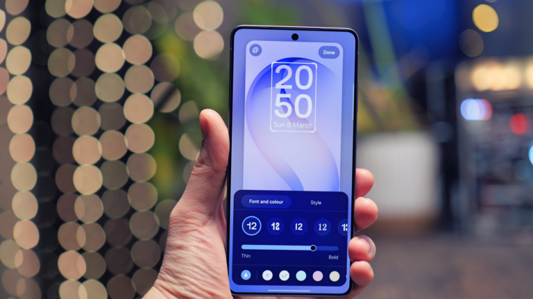
UK reviewers who test multiple Android skins side by side say the newest OriginOS direction is now entering a comparison zone where it is being evaluated against OxygenOS and Samsung One UI, because those two skins have been the most trusted in Western markets for stability, polish, and modern visual rhythm. British analysts say that vivo’s refined visuals, calmer spacing decisions, and more consistent motion language make OriginOS feel more mature than older vivo builds. They say this is the first time OriginOS is being reviewed in the same conversation category as these Western market leaders rather than being treated as a China-only niche interface.
UK commentary says OxygenOS is still considered a reference point for clean behaviour, because it prioritises speed, directness and minimal visual noise. British reviewers say this has built long-term trust with UK consumers. When they compare that with the latest OriginOS builds, they say vivo is now moving toward that same priority. They note that vivo has reduced dense layering, reduced busy UI surface depth, and now uses more grounded animation pacing. They say this calmer behaviour puts OriginOS closer to the “no nonsense” identity that made OxygenOS popular in the UK.
British analysts also compare OriginOS against Samsung One UI, because Samsung has dominated the UK Android space for years. They say One UI uses visual restraint combined with friendly geometry, and British reviewers say this is exactly what consumers expect from a premium Western UI. When they look at OriginOS, they say the new design language resembles this approach more than earlier versions did. They describe it as a shift toward structured control zones and predictable motion. UK tech writers say this is important because Western audiences do not reward visual chaos. They reward clarity and stability.

Reviewers also say OxygenOS still delivers a more direct tone, while One UI delivers a more comfortable tone. British voices say OriginOS now appears to sit comfortably between those two philosophies. It looks cleaner than older vivo builds and more consistent than many Chinese skins, but it also retains its own personality. They say this might help vivo differentiate itself without confusing Western users. In the UK, this balance matters because consumers want novelty without losing usability logic.
UK analysts emphasise that one final factor still remains: reliability on British firmware. They say UI design can look premium, but it must remain stable inside UK builds once banking apps, carrier networks, NFC payments, and Google Play compliance are active. British reviewers say OxygenOS and One UI have earned trust because they perform consistently inside UK infrastructure. They say OriginOS will need to pass the same daily reliability tests before it can be fully accepted as an equal. They say that comparison only becomes complete when British units receive the update across retail channels.
British tech writers think vivo understands this. They say the visual refinement looks intentional and not experimental. They say this suggests vivo is positioning OriginOS as a Western-ready UI instead of a region-locked interface. They say that if the stable visual direction is matched by stable rollout behaviour, then UK buyers might begin comparing vivo phones in stores the same way they compare Samsung or OnePlus models.
Overall, UK reviewers say the new OriginOS now belongs in the same discussion category as OxygenOS and One UI because its visual tone and motion consistency now reflect modern Western UI behaviour. They say Western acceptance is no longer limited by looks — it now depends on whether vivo delivers consistent performance in British firmware layers during real distribution. They say if that final step is successful, the new OriginOS could become a competitive UI option for UK consumers who want a refined interface with modern pacing.

