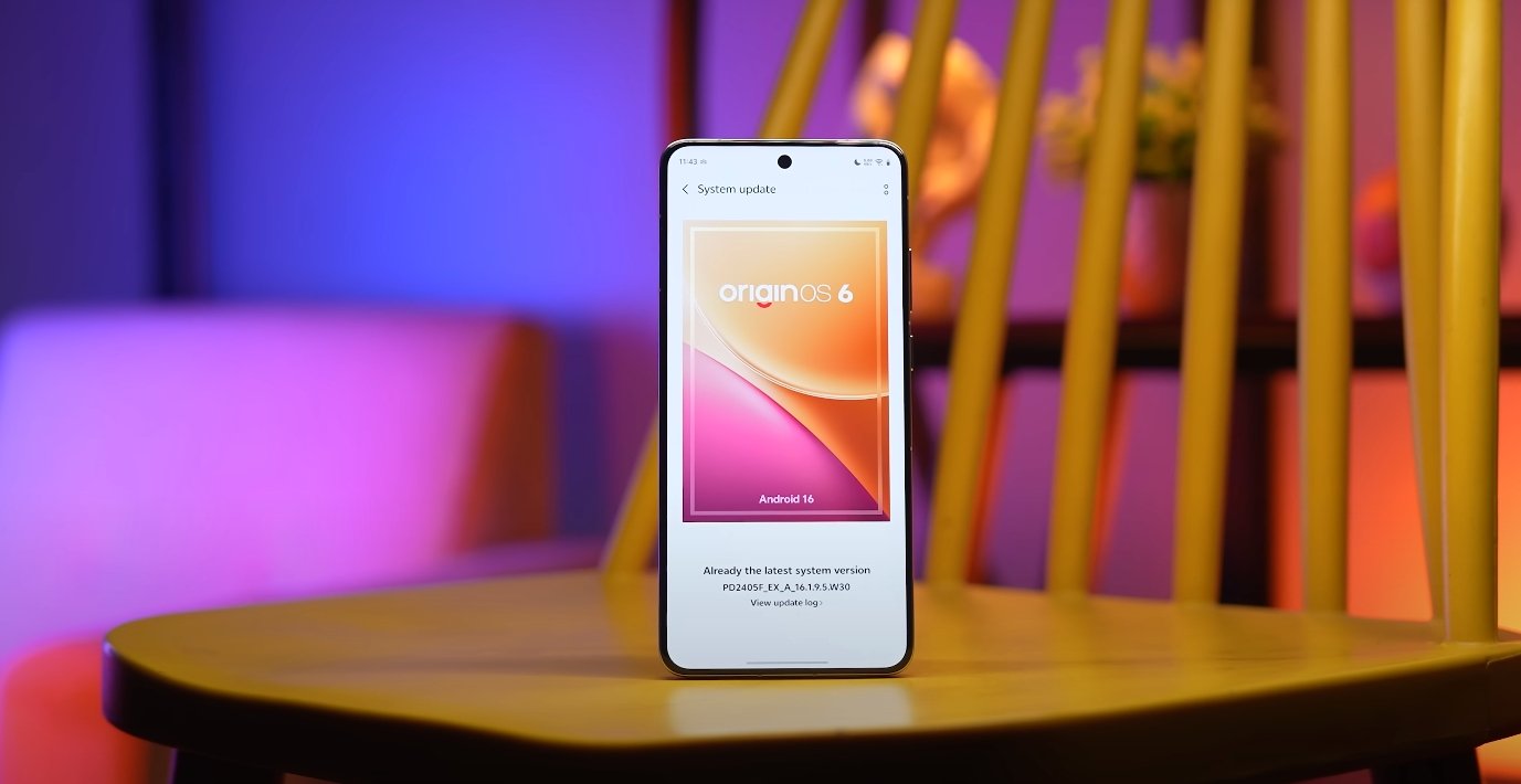
OriginOS 6 vs Android 14 visual design changes
Comparing Vivo’s new interface with Google’s latest OS
OriginOS 6 and Android 14 offer two distinct approaches to visual design and user experience. While both are built on the latest Android foundation, Vivo’s OriginOS 6 focuses on immersive animations, depth, and dynamic customization, whereas Android 14 emphasizes minimalism, personalization, and streamlined functionality. These differences reflect the companies’ design philosophies and their target user experiences.
OriginOS 6 introduces Vivo’s “Light and Shadow Space” design, which emphasizes depth and motion to create a more tactile interface. Elements like soft-rounded corners, structured card layouts, and layered transparency contribute to a visually rich environment. Animations are smoother and transitions more fluid, providing users with a sense of natural movement. Android 14, on the other hand, builds upon the Material You design language, now called “Material 3 Expressive.” This version focuses on vibrant colors, bold typography, and simplified interface elements, giving users more flexibility to personalize their devices without overwhelming the visual hierarchy.
One of the most noticeable changes in OriginOS 6 is the lock screen. The interface now uses dynamic modules that adapt to user activity. Features such as adaptive folders, 4×7 grid layouts, and Flip Cards respond to device orientation, while the “Origin Island” displays real-time notifications and statuses, similar to dynamic interactive widgets. Android 14 enhances lock screen customization by allowing shortcuts, improved at-a-glance information, and simpler wallpaper switching. Both systems aim to give users relevant information at a glance, but OriginOS 6 uses more layered and animated visual cues, while Android 14 prioritizes straightforward readability and accessibility.
Animations and transitions are another area where the two OS versions differ. OriginOS 6 incorporates the “Origin Smooth Engine,” which powers fluid transitions such as Spring Animation, Blur Transition, and Morphing Animation. These effects create a rhythmical flow throughout the interface, enhancing the sense of immersion. Android 14, while also improving animation smoothness, focuses more on subtle transitions and monochromatic modes that reduce visual noise and maintain a consistent, minimalistic experience. The approach in Android 14 prioritizes functionality and clarity over visually striking effects.
Typography and fonts have been updated in both systems to complement their visual strategies. OriginOS 6 introduces Vivo Sans 2, a font designed for consistency, readability, and support across multiple languages. This choice enhances the overall aesthetic by harmonizing text with the dynamic visual environment. Android 14 emphasizes bold and expressive typography as part of its Material 3 Expressive design, allowing for more creative use of text and headings while maintaining legibility and a clean interface. Both systems focus on clarity, but Vivo emphasizes uniformity, while Android 14 encourages personal expression.
Wallpaper and visual depth are also treated differently. OriginOS 6 includes dynamic wallpapers that adapt to lighting and device activity, adding visual interest while maintaining performance efficiency. These wallpapers work in tandem with the layered UI to create a sense of three-dimensional space. Android 14, in contrast, focuses on Material You’s dynamic color theming, which extracts colors from the user’s wallpaper and applies them consistently across system UI elements. This approach ensures a cohesive aesthetic with minimal distraction, emphasizing user choice and system-wide visual consistency.
Customization beyond wallpapers is a highlight of both operating systems. OriginOS 6 allows users to adjust clock styles, icon layouts, and interactive widgets on both the home and lock screens, giving the OS a unique and personal feel. Android 14 continues to expand on Material You personalization, enabling users to modify system colors, shapes, and interface styles across apps and menus. OriginOS 6 prioritizes a visually immersive and dynamic experience, whereas Android 14 emphasizes simplicity and coherence, giving users an interface that feels clean yet flexible.
In conclusion, OriginOS 6 and Android 14 cater to different user preferences when it comes to visual design. OriginOS 6 delivers a dynamic, immersive interface with layered animations, adaptable widgets, and rich visual depth, appealing to users who enjoy expressive and tactile design. Android 14 focuses on minimalist elegance, smooth personalization, and consistent color theming, targeting users who prefer a clean, straightforward interface with subtle customization options. Both operating systems improve the user experience through thoughtful design changes, but the choice ultimately depends on whether the user values immersive visual effects or streamlined minimalism.
Also Read: OxygenOS 16 lock screen and AOD customization review